
Start With The Entrance Sign Guests See First
The entrance is where the mood is set, so this is often the best place to use a larger wooden sign. A welcome board can carry the couple’s names, the wedding date, and a short line such as "Welcome to our wedding" or "Glad you could join us". For outdoor venues in Somerset West, Stellenbosch or the Helderberg area, a sealed timber finish is worth considering because morning mist and evening humidity can affect unsealed wood.
If the venue has a gate, driveway or lawn entry, the sign should be easy to read from a few metres away. Bold lettering and a clean layout usually work better than too much detail. We often suggest pairing the main welcome sign with a smaller directional panel so guests know where to park, where the ceremony starts, or which path leads to the reception. It saves the ushers time and keeps the flow calm.
- Keep the wording short and direct
- Use high contrast between the wood and the lettering
- Ask for a base or stand if the sign will sit on grass or gravel
- For windy coastal venues, plan for extra weight or fixing points
Table Numbers And Seating Signs That Do More Than Organise
Table numbers are one of the easiest ways to bring wooden signage into the reception without overdoing it. They are practical, but they can also be styled to match the rest of the decor. A couple choosing a rustic barn setting near Paarl may want natural wood grain visible, while a modern hall in Cape Town might suit painted panels with simple cut lettering.
Seating signs can also be used to guide guests to family tables, reserved seating, or a special head table. The important thing is to keep them readable at a glance. Smaller signs work best when the font is clear and the size is enough for guests to notice while walking between the bar, dance floor and buffet.
For larger guest lists, a table plan board is usually easier than individual notes scattered around the venue. It looks tidy and helps the event team place people quickly, especially where the reception starts on time and guests arrive in groups.
- Use one style across all table numbers for consistency
- Match the size to the room so signs do not get lost on a big table
- For destination weddings, courier packing should protect corners and engraved faces
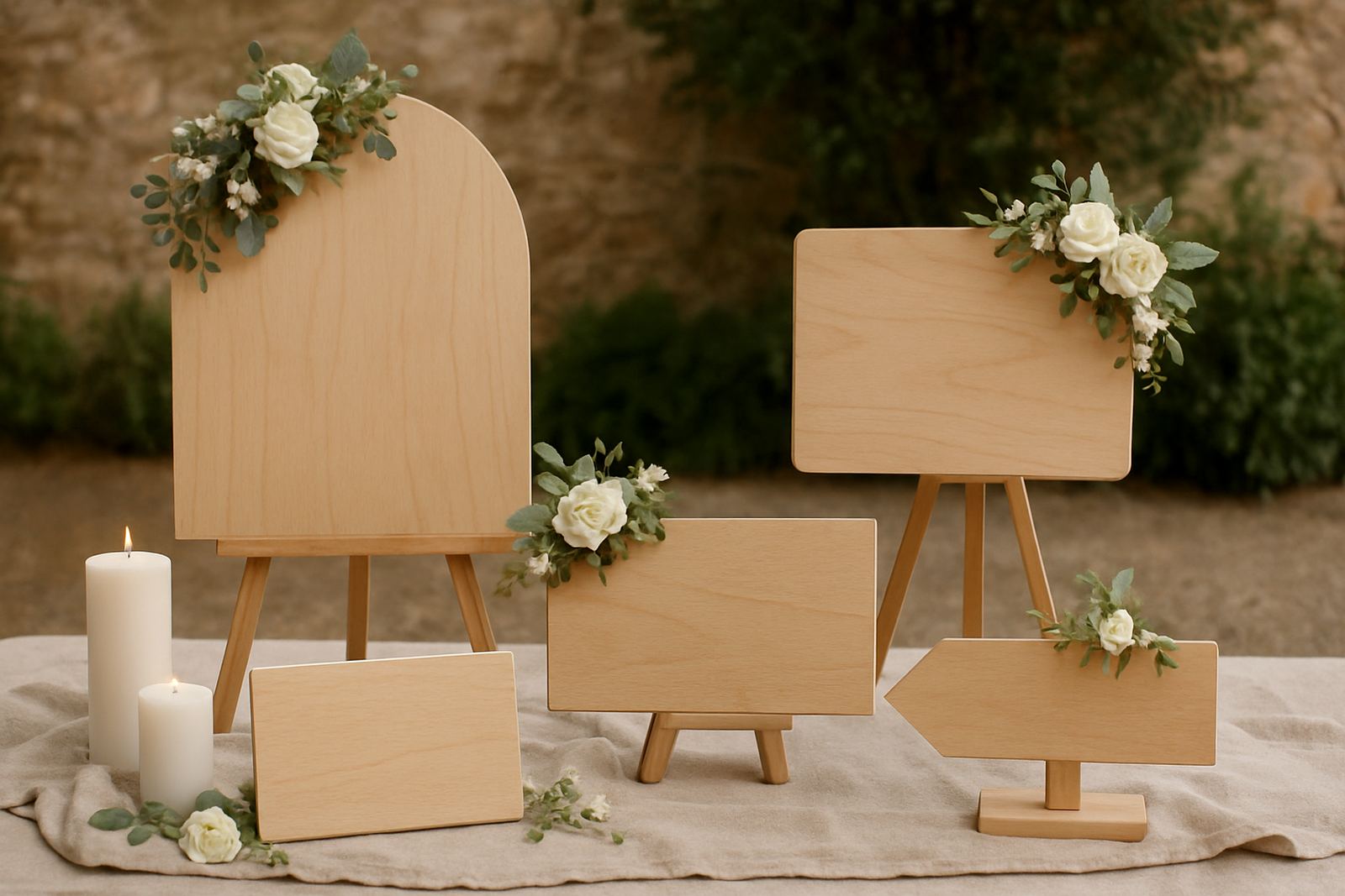
- Consider a standing easel if the venue does not allow wall fixing
Ceremony Signs That Guide Without Interrupting The View
The ceremony area usually benefits from signs that are useful but not distracting. A simple order of events board, unplugged ceremony notice, or directional sign can help guests understand what to do without needing repeated announcements. This is especially handy at vineyard venues and private homes where the ceremony and reception spaces are separate.
Wooden signage works well here because it can sit naturally among flowers, candles and linen. If the ceremony is outdoors, the finish matters. In summer, direct sunlight can fade some coatings over time, and at a coastal venue near Strand or Gordon’s Bay the salty air can be hard on untreated materials. A properly finished board lasts better and looks neat for the full day.
For couples who want a more personal touch, one of the most effective ideas is a quoted line or short verse on a standing sign near the aisle. Keep it short enough to read in a few seconds. The sign should add to the setting, not pull focus from the couple or the floral design.
- Use ceremony signs for timing, seating and etiquette notes
- Choose finishes that handle sun and humidity
- Place the sign where it can be read before guests sit down
- Avoid overcrowding the message with too many lines
Photo Corner Signs That Guests Actually Use
A photo area is one of the most popular places for personalised wood signs because people naturally gather there. A couple’s names, a hashtag, or a playful line can give guests a reason to stop and take pictures. When the sign is made in layered wood, it photographs well because the depth shows up nicely under both natural light and reception lighting.
There is also a practical side. A sign can mark the photo booth, the Polaroid guestbook station, or the audio guest message corner, so guests know exactly where to go. At events with many moving parts, a clear sign prevents the coordinator from having to explain the same thing over and over. That is useful at bigger weddings where the reception area fills quickly.
If the couple is planning to use the signs again at a home, office or family property after the wedding, we often suggest a design that is personal but not too date-specific. That way the piece stays relevant as decor long after the reception is over.
- Use a photo-friendly message with short words and strong lettering
- Consider layered wood for more depth in pictures
- Keep the sign away from harsh backlight where possible
- Ask for a reusable stand if the sign will move between areas
How To Match Wooden Signs To The Rest Of The Wedding
One of the simplest ways to make signage look considered is to match it with the couple’s other details. If the invitations use a clean serif font, the signs can follow that shape. If the flowers are natural and loose, the wood can be left lighter and less polished. If the wedding is more formal, painted lettering and a darker stain usually look better.
It also helps to think about scale. A big entrance board, medium-sized ceremony pieces and smaller table signs create a balanced set. This avoids the common problem of one item being oversized while the others disappear into the room. In practical terms, the venue layout should guide the size of each piece, not just the style choice.
For couples ordering from the Western Cape or further afield, it is worth checking timelines early. Signage often goes through several steps, from layout approval to cutting, engraving, finishing and packing. If there are multiple items for different parts of the day, the pieces should be planned together so the wording and size stay consistent.
- Choose one font family or lettering style across the event
- Keep a single colour palette for all wooden pieces
- Plan the order of use from entrance to ceremony to reception
- Allow time for approval if names, dates or wording may change
A Local Example From Somerset West To Hermanus
A recent Western Cape wedding order brought together a welcome sign, ceremony instructions, table numbers and a small guestbook sign for a venue between Somerset West and Hermanus. The couple wanted something warm and practical, not overdecorated. They were marrying in a garden setting with sea air nearby, so the finish had to cope with morning damp and the move from ceremony lawn to reception tent.
The welcome board carried the names and date, while the table numbers used the same lettering style in smaller format. The guestbook sign sat beside a simple wooden box and worked as a clear prompt for guests. Because everything followed the same look, the whole set felt like one plan rather than separate items ordered at random. The venue team also appreciated that each piece was easy to place and pack away after the event.
That is usually the best result with wedding signage. It should be attractive, yes, but it must also make the day run better. A sign that looks good and helps guests move through the space does its job properly.
If you are planning a wedding in Cape Town, Stellenbosch, Paarl, Durbanville, Gordon’s Bay, Strand or beyond, start with the spaces where guests will actually need guidance. From there, the rest becomes much easier to shape.