What makes a layered sign different on the wall
A flat sign can do the job, but a layered sign adds raised elements that catch light and throw a natural shadow. That small change makes lettering and shapes easier to read, especially when the sign needs to stand out in a busy entrance, a wedding venue or a retail space with mixed colours and textures around it.
In practical terms, layered signage is built from separate cut pieces that are mounted on a backing board or assembled into a raised composition. The result is a sign with more presence and a better sense of scale. For Somerset West homes with clean modern finishes, or a coffee shop in Stellenbosch with timber shelves and painted walls, that extra depth helps the sign feel considered rather than just printed and hung up.
- Raised letters create stronger contrast without needing bright colours.
- Shadows change through the day, so the sign keeps visual interest.
- Different timber tones can be used to separate names, logos and icons.
Why depth helps people notice your message faster
People read signage quickly. They are usually walking past, loading a car, checking into a venue, or looking for a shop entrance while juggling bags and children. Layered signs help because the eye picks up the edges first, then the wording. That is useful where there is glare from glass, strong daylight or a lot of activity around the sign.
A sign with depth also reads better at different angles. If the viewer is standing off to one side, the raised face still catches enough light to remain clear. This is especially useful for businesses in Cape Town, Paarl and Hermanus where signage often has to compete with weathered exterior walls, coastal brightness or nearby street activity.
- Better visibility in morning and afternoon sun.
- Improved legibility for drive past traffic.
- Stronger presence in photographs for events and launches.
Wood, finish and thickness all change the final result
Not every layered sign should be made the same way. The timber choice, thickness and finish need to suit where the sign will sit. Indoor signs for weddings or interior branding can use finer detail and lighter finishes, while outdoor pieces need more careful sealing and a design that will not trap too much moisture at the edges. Near the coast, that matters a lot because humidity can affect raw timber if it is left unsealed.
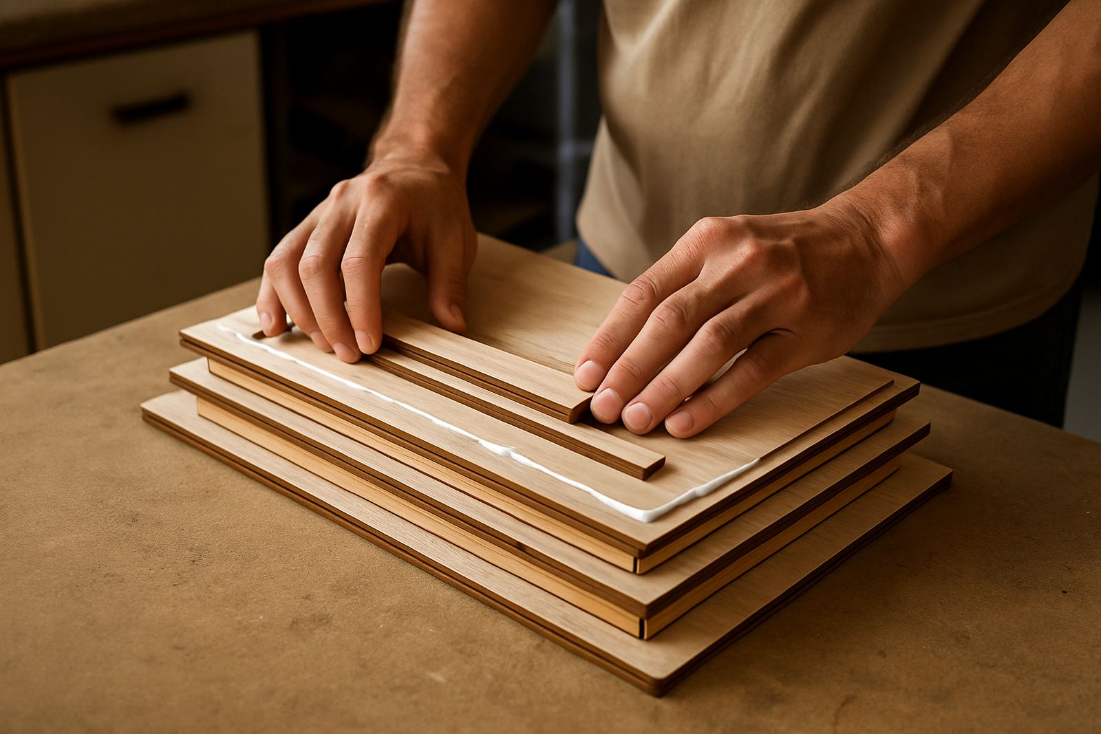
For a sign to look good for longer, the layers must be cut cleanly and assembled with care. Uneven joins, fuzzy edges or weak adhesive will show up quickly once the sign is mounted. Good finishing also matters because natural wood grain can either support the design or distract from it. A test sample is often worth doing before a full run, especially for bulk orders or corporate pieces.
- Thicker layers give stronger shadow lines and a bolder look.
- Sealed edges help reduce swelling in damp or coastal conditions.
- Sample pieces make it easier to confirm colour and scale before production.
Where layered signs work best in real South African spaces
Layered signs suit a wide range of uses because they can be tailored to the setting. At home, they are often used for surname plaques, nursery names and braai area decor. For weddings, they work well for welcome boards, seating charts and bar signs. For shops and studios, they are useful for logo signs, service lists and reception branding. They can also be made in batches for corporate gifts or event activations where consistency matters.
A good local example is a guesthouse in Hermanus that wanted a wooden welcome sign visible from the driveway and the front stoep. A flat board blended into the painted wall, but a layered sign with a raised house name and small icon stood out much better against the changing light and sea air. Once mounted under cover it gave the entrance a clearer identity and was easier for arriving guests to spot.
- Homes: family names, house numbers, room signs.
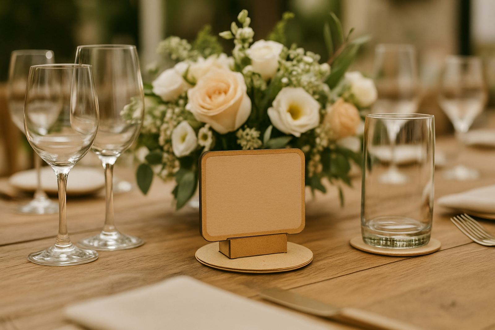
- Events: welcome signs, table numbers, directional boards.
- Businesses: reception logos, storefront signs, branded wall pieces.
What to consider before ordering a layered sign
The main decision is not just the wording. It is how the sign will be viewed, where it will hang and how long it needs to last. A sign for an indoor event in Somerset West can be lighter and more delicate. A sign for an outdoor shopfront in Strand or Gordon's Bay needs stronger fixing points and a finish that can handle sun and moisture. If the sign will be moved often, the weight also matters.
It helps to think through the message before production starts. Short names and bold wording usually work best for signs seen from a distance. Longer lines can be used, but they need more space and careful spacing so the sign does not feel crowded. If the design includes logos or icons, those should be simplified enough to cut cleanly and remain readable once layered.
- Check viewing distance before choosing text size.
- Decide if the sign is indoor only or exposed to weather.
- Think about mounting, wall material and whether the sign will need standoffs or hidden fixings.
How layered signs are produced with care from Somerset West
Layered signs need proper planning from the first cut to the final pack out. At LaserCrafts, the process usually starts with a creative consultation and a sample check, then moves into cutting, engraving if needed, assembly and finishing. That workflow matters because each stage affects the next one. If the cut is off by even a small amount, the layers will not align correctly later.
For clients in Somerset West, Stellenbosch, Cape Town, Paarl, Hermanus and beyond, courier packing is part of the job too. The sign has to arrive without chips, edge damage or pressure marks, which means the packaging must suit the shape and weight of the piece. For bulk orders, this becomes even more important because each sign needs to look the same when it reaches the customer and not one should arrive with a loose layer or scuffed corner.
People often choose layered signs because they want something with more character than a flat board. That character only works when the design is practical as well as attractive. The right timber, clean cutting and careful finishing turn a simple message into a sign that feels solid, clear and worth keeping.
- Best for signs that need depth and stronger visibility.
- Suitable for homes, shops, weddings and corporate use.
- Works well when the design is planned around light, distance and local conditions.