
Start With Where the Sign Will Be Hung
An interior logo sign in a reception area has different needs to a sign above a coffee bar or in a shop fitting. Before any cutting starts, it helps to look at the wall surface, the size of the logo, the distance from which people will view it and whether the room gets strong sunlight, air-conditioning or damp coastal air. In Somerset West and along the Helderberg, we see a lot of spaces where the sign looks great in the morning then shifts through hard light by midday, so contrast matters just as much as timber choice.
If the sign is going into a tiled wall, painted drywall or a feature timber wall, the fixing method changes too. A layered sign with a backing board may need stand-offs or hidden screws. A lighter single-layer piece can often be mounted more simply. For bigger logo signs, especially in offices or retail spaces, weight is a proper consideration because not every wall takes the same load.
- Measure the wall width and leave breathing space around the logo
- Check whether the sign will be viewed straight on or from an angle
- Ask whether the area is dry, air-conditioned or close to the coast
- Decide if the sign needs hidden fixings or visible spacers
Picking the Right Timber for the Look You Want
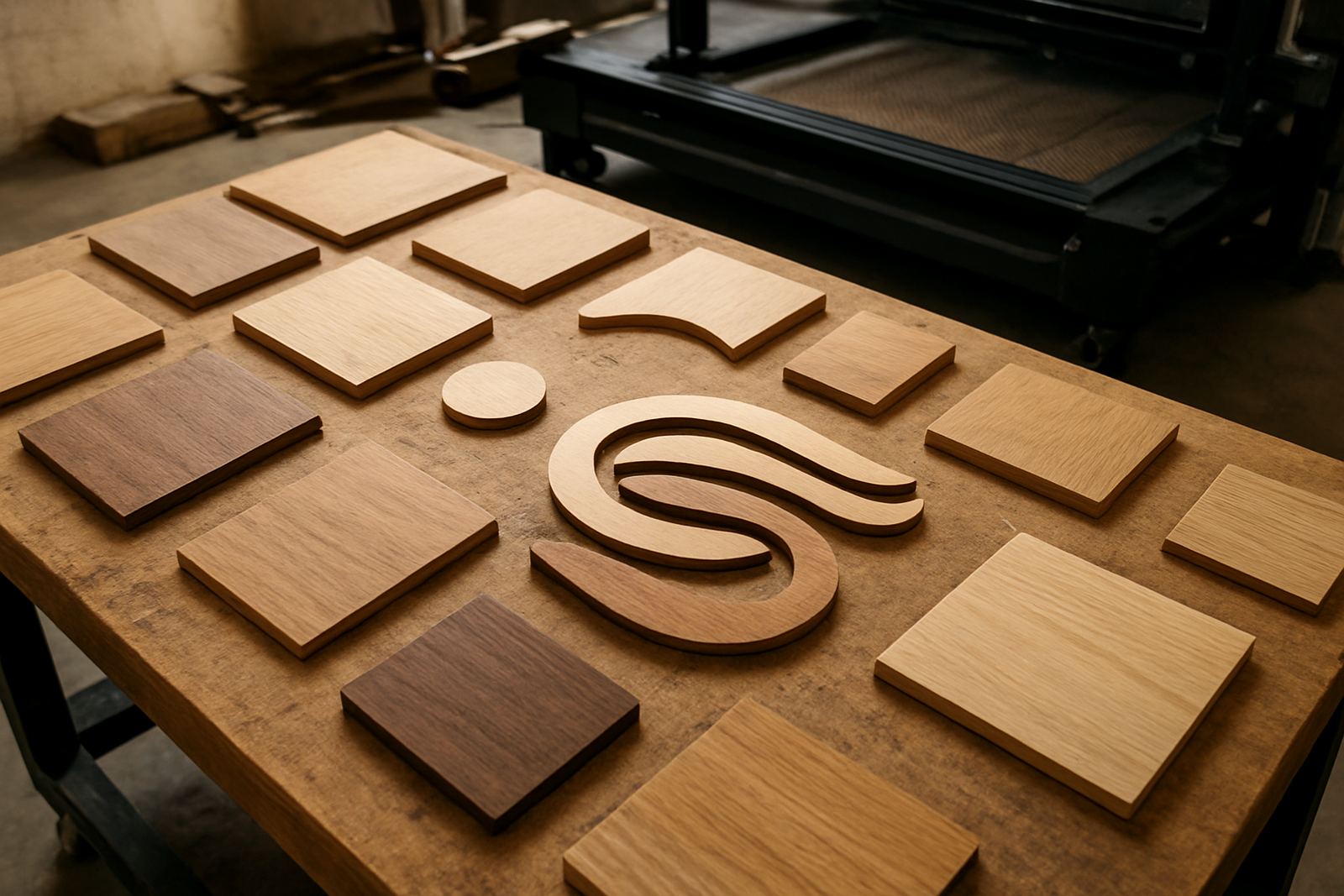
The timber itself can change the whole feel of the sign. Smooth, pale boards suit clean corporate interiors and wedding venues. More textured woods work well for lodge-style spaces, restaurants and businesses that want a warmer feel. For indoor logo signs, we usually guide clients towards stable sheet timber that cuts cleanly and stays consistent across a full order.
Thicker material gives a stronger look and can help small details stand out, but it is not always the best answer. Very fine lettering may need a thinner face to keep edges crisp. If the logo includes narrow joins, the material should be chosen with the smallest part in mind. That keeps the finished piece readable and avoids weak points after sanding and finishing.
For clients in coastal towns like Strand, Gordon's Bay and Hermanus, humidity can affect certain finishes over time. That does not mean a timber sign is a bad choice, only that the build should be planned properly. A sealed face, well-finished edges and correct backing make a real difference over the years.
- Light, even-grain boards suit modern office interiors
- Wider-grain timber can suit hospitality and lifestyle spaces
- Thicker boards work best for bold logos and larger lettering
- Stable sheet timber is often better for repeat cuts and batch orders
When Layered Construction Makes More Sense
Layered logo signs are useful when the design needs depth, contrast or a more premium finish. A base board can carry the full shape while raised letters or shapes sit on top for definition. This is often the better choice for reception walls, salon interiors, school foyers and event venues because the layers catch light and create clear separation from the wall.
A layered sign also allows for material mixing. One layer can be painted, another left natural, and a third stained or sealed darker. That gives more room to match the sign to counters, wall colours or furniture. In some cases the layer build is purely practical too. If the logo has thin strokes or small icons, a backing layer can give strength without making the front face too heavy.
There is a balance though. Too many layers can make the sign bulky or fussy. The best layered signs read clearly from a few metres away, which is what matters in most interiors. A good rule is to keep the structure simple and let the logo do the talking.
- Use layering when the logo needs depth or shadow
- Mix finishes only if the brand colours and room colours work together
- Keep the build neat enough for easy cleaning in public spaces
- Avoid overcomplicating small logos with too many separate parts
Finish Choices That Hold Up Indoors
The finish is where a logo sign moves from raw timber to a proper fitted piece. Clear sealing keeps the grain visible and gives a more natural look. Paint gives stronger contrast and can be matched to a brand colour scheme or interior palette. A stained finish sits in the middle, bringing warmth while still showing the timber beneath.
In practice, the finish should match the use of the space. A busy retail counter may need a more wipeable sealed surface. A wedding venue might prefer softer tones and a more natural look. A corporate foyer may need clean edges, crisp colour breaks and a finish that does not reflect light too much from ceiling spots. Small details like edge sealing matter more than people often think, because laser-cut edges can absorb finish differently if left untreated.
It also helps to plan for daily cleaning. Inside a shop or salon, the sign may pick up dust from air movement and product spray. If the finish is too delicate, it can mark early. That is why a little testing goes a long way before a full run is cut.
A Somerset West Example: Reception Signs for a Coastal Practice
A good example is a Somerset West professional practice looking for a logo sign for its reception wall. The room had natural light from one side, a painted wall finish and a fairly narrow viewing angle from the entrance. The brief was simple: warm, legible and not too glossy. A layered build worked well here, with a pale base, raised lettering and a sealed finish that would hold up against the coastal humidity without looking shiny.
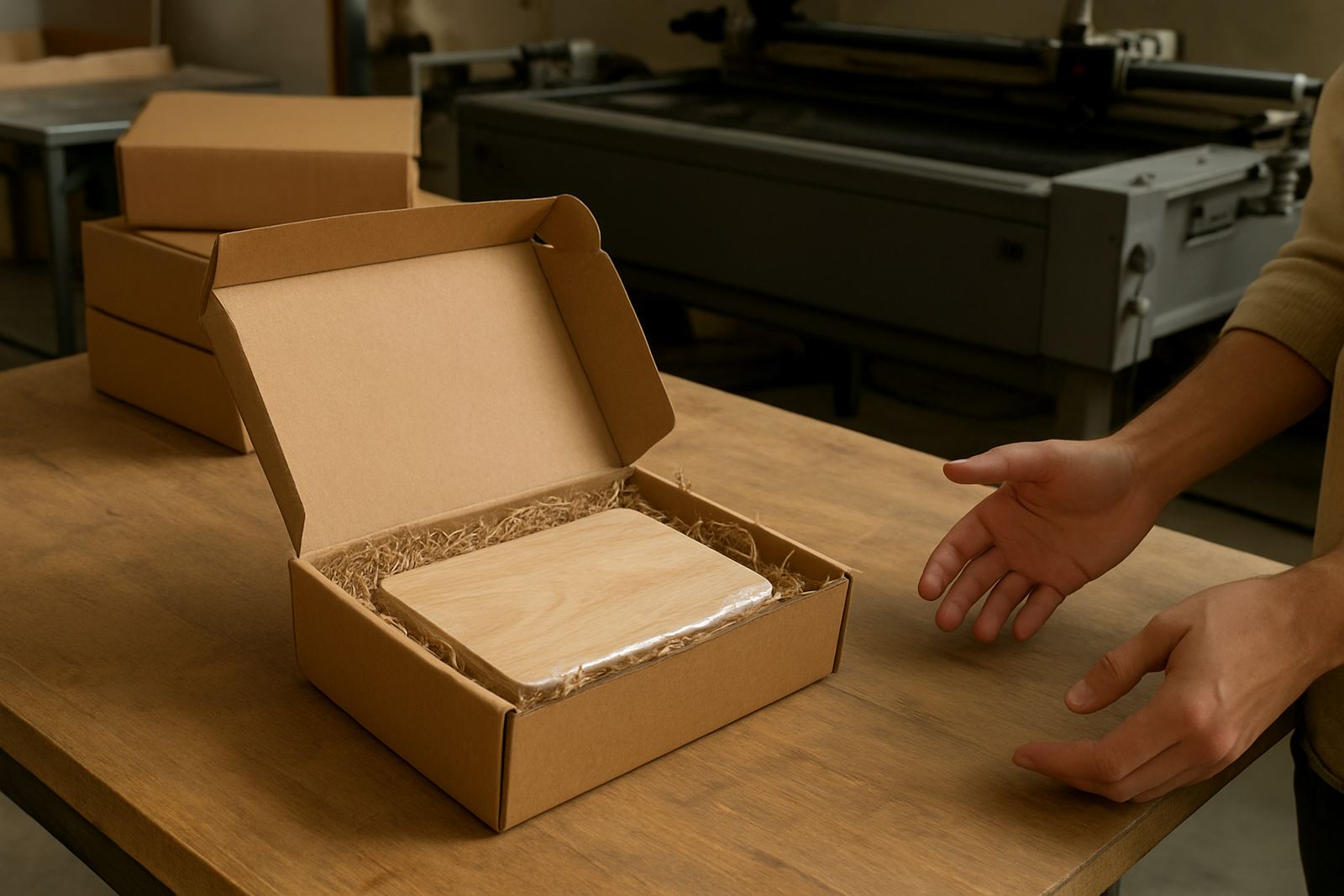
Because the logo had fine internal spaces, the material choice mattered. A thicker face would have made the small details look clumsy, so the design was adjusted to suit a more stable sheet timber and a clean backing board. The result was easier to mount, easier to clean and better balanced on the wall. That kind of practical adjustment often saves time later, especially when the sign has to travel by courier to other towns or be installed on a tight programme.
We see the same thinking on projects for Stellenbosch offices, Cape Town retail spaces and Paarl studios. The best material choice is not always the most expensive one. It is the one that fits the wall, the light and the use of the space.
What to Send Through When You Enquire
When planning a logo sign for an interior space, a few details help shape the right material plan from the start. The clearer the brief, the easier it is to recommend whether a single timber face or a layered build will work best. This also makes it easier to quote for bulk orders, event sets or multiple delivery points across the Western Cape.
When clients use the enquiry form, it helps to include the wall size, logo artwork, preferred finish and where the sign will be used. If you have a timeline tied to a launch, wedding or shop opening, mention that as well. For business clients, it is also useful to say whether the sign needs to match other branded pieces in the same space.
- Wall measurements and a photo of the space
- Logo file or clear artwork
- Preferred size and finish
- Town for delivery or collection
- Any timing details for installation or event day use
With the right material choice, a logo sign can do more than fill a wall. It can make the entrance feel settled, professional and ready for visitors.