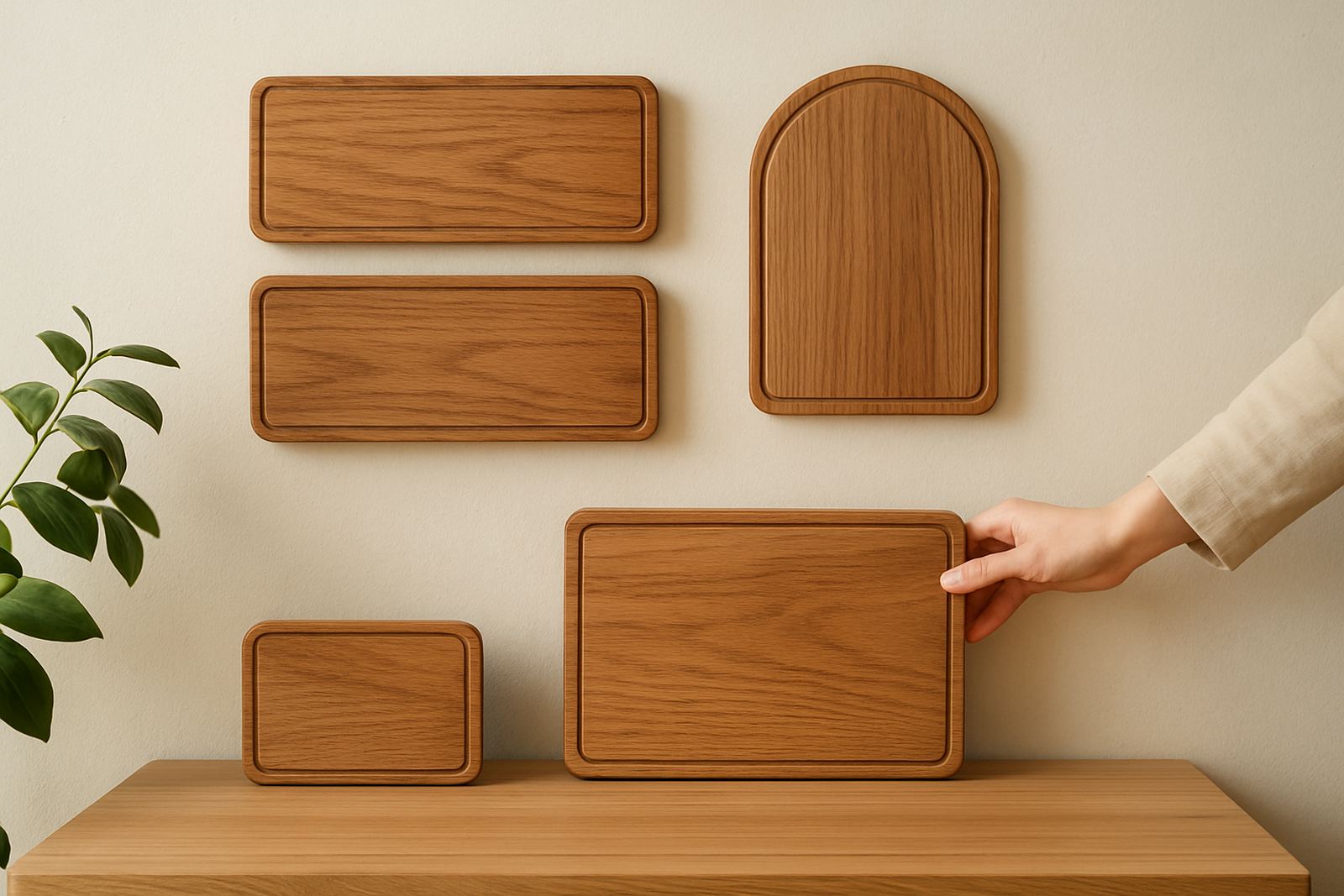

Why size matters before the first cut
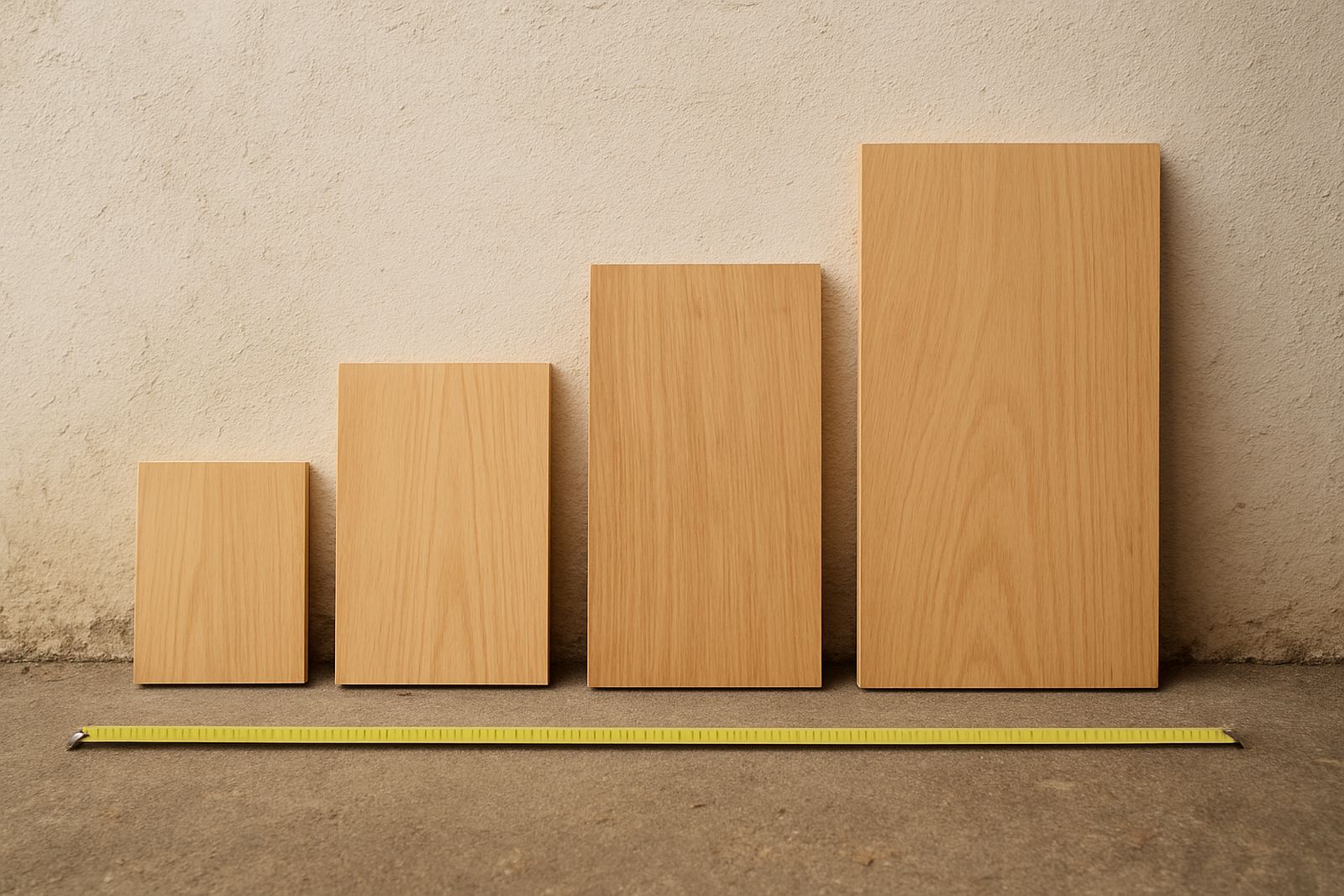
With wooden signs, size affects everything from how far away the message can be read to how well the grain, layering and lettering hold together. A sign that looks perfect on a workbench can feel too small once it is mounted above a shop counter or too large in a narrow passage at home.
As a practical rule, think about the viewing distance first. A welcome sign at a front door might only need to be read from 1 to 2 metres. A shop fascia on a busy street in Somerset West or Cape Town needs to work from across a pavement or parking area. That usually means larger lettering, stronger spacing and a clearer shape. If the sign is being viewed from the road, you often need bolder proportions than you would for an indoor wall piece.
- Short viewing distance: smaller, more detailed wording can work well.
- Medium viewing distance: keep the wording simpler and allow space around each line.
- Long viewing distance: use larger letters and fewer words.
When the size is wrong, the design can feel cramped or lost. That is where good sign planning starts, not with the artwork but with the wall, door, window or stand where it will live.
Reading distance and letter height
Letter height is one of the most useful guides for sign sizing. If the text is too small, people will lean in and miss it. If it is too large, the layout can feel overblown and the sign may overtake the space around it. For wooden signs, the material thickness and cut style also affect how bold the letters appear.
For wood signs and laser-cut lettering, the easiest rule is to match letter height to viewing distance:: the farther away the viewer will stand, the taller the letters should be. For a reception wall, a name can be elegant and compact. For a shop entrance in Stellenbosch or Paarl, the business name should be visible at a glance. For event signage at a wedding venue, the couple names may be more decorative, but the date or directions still need to be easy to read.
- Use fewer words when the viewing distance increases.
- Choose clear letter shapes for important information.
- Leave enough space between lines so the text does not blur together.
There is also the question of contrast. A pale wooden face with engraved wording can read very differently to a layered sign with raised text. The same size can behave differently depending on finish, stain and background tone.
Matching the sign to the wall or window
Size should always suit the surface it is going onto. A sign that is too small can look lost on a large blank wall, while one that is too wide may overwhelm a narrow passage or doorway. The best proportions usually leave breathing room on every side, so the sign looks placed rather than squeezed in.
For homes in coastal areas like Strand or Hermanus, wall space often includes textured plaster, timber cladding or bright natural light. That means the sign must be sized with the real setting in mind, not just a drawing. In a shopfront, you also need to consider glass reflections, awnings, security gates and window frames. The same sign can read very differently at 9am and again at sunset.
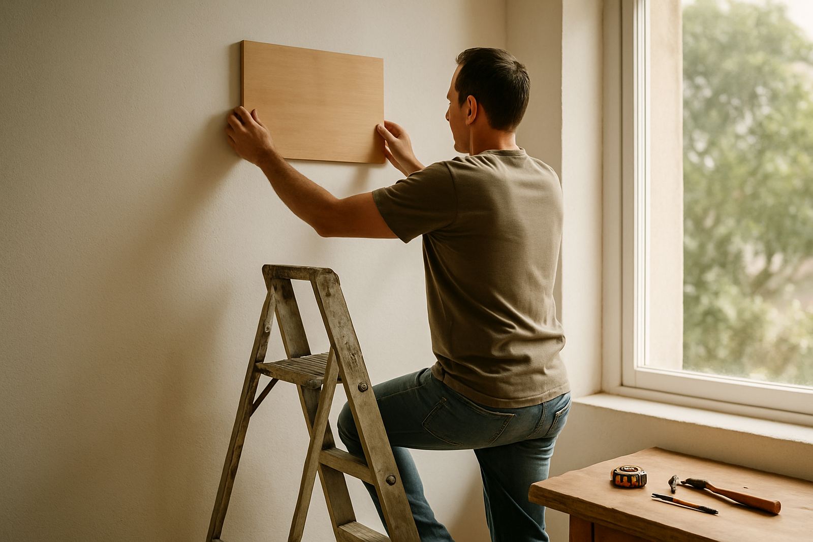
- Measure the exact wall or window area before approving a design.
- Leave a border of space around the sign so it does not crowd fittings.
- Allow for mounting hardware, standoffs or hanging chains if used.
If you are planning a pair of signs, such as an opening hours panel and a logo board, keep them related in size so the display feels orderly. Uneven pieces can work, but only when the imbalance is clearly intentional.
Small signs can still work hard
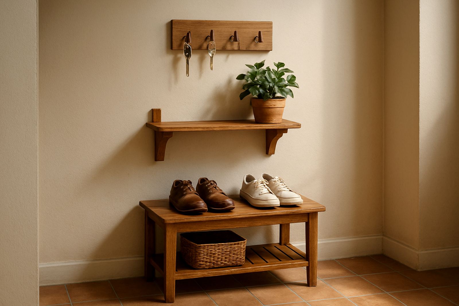
Not every sign needs to be large. Some of the most effective wooden pieces are quite compact, especially when the message is short. A small plaque for a nursery door, a table number at a wedding, or a directional marker in a shop can be just right when the wording is brief and the setting is close.
Small signs do need careful detailing though. Thin lettering, tiny flourishes and overly packed layouts can be difficult to cut cleanly and even harder to read after finishing. If the sign will be handled often, moved between venues or used outdoors, the size should allow for enough strength in the material so it does not chip or warp.
For corporate gifts or branded plaques, smaller sizes are often better because they are neat and easy to post by courier. In those cases, the goal is clarity and finish, not sheer presence. The piece should feel considered, not cramped.
- Keep short messages short. A few strong words often work best.
- Use thicker borders on small signs for strength.
- Avoid overly fine cut-outs if the sign will travel or be handled often.
Layered signs and the effect of depth
Once you add layers, size becomes more than width and height. You also need to think about depth, shadow and visual weight. A layered wooden sign with a base plate, raised text and a decorative frame will look larger than a flat engraved board of the same outer measurements.
This matters for reception areas, retail displays and feature walls. A 600 mm sign with layered lettering may command as much attention as a much larger plain board. The extra depth can add presence, but it can also make the sign feel heavy if the space is small. In a compact shop or hallway, that extra dimension needs to be handled with care.
For event signage, depth can be a useful way to create hierarchy. The main title can sit higher and larger, while supporting details stay lower and slimmer. That way the eye knows where to go first. It is a practical approach, not just a decorative one.
A Somerset West example that gets the balance right
Imagine a wine farm outside Somerset West needing a welcome sign for the entrance and a smaller board for the tasting room. The entrance sign has to be read from a vehicle moving slowly past the gate, so the name, logo and venue line need generous letter height. The tasting room sign, by contrast, is seen up close and can carry a finer message, perhaps with the opening times or a simple directional note.
If both signs were made the same size, one of them would feel wrong. The entrance piece would be too modest for the road, or the indoor board would feel too bold for the room. Matching the sign to its job is what gives it balance. That is especially important in the Western Cape, where bright daylight, long sight lines and mixed indoor and outdoor use can expose sizing mistakes quickly.
For businesses in Cape Town, Paarl, Hermanus and across the province, this same principle applies whether the order is going by courier or being installed locally. Good size planning saves time, reduces rework and gives the finished piece a proper place to belong.