
Start With The Wall, Not The Logo
Before cutting any sign, work out where it will live. A logo sign on a narrow passage wall needs different treatment from one above a reception counter or in a showroom. The height of the wall, the viewing distance and what sits around it all affect the final result. In Somerset West and around the Helderberg, many businesses use brick, painted plaster or timber feature walls, and each surface catches light differently.
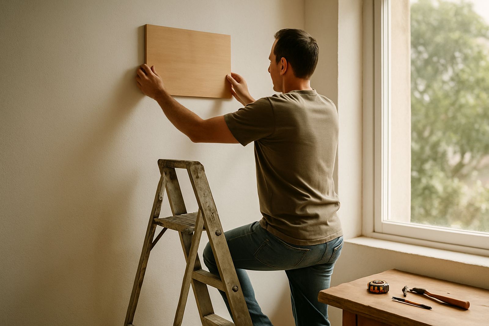
A sign should feel part of the room, not squeezed into the leftover space. Measure the wall, then mark the centre point and the likely eye level. For most indoor displays, the centre of the sign sits around 1.5 to 1.7 metres from the floor, but that can shift if people will be seated or if the sign hangs above a counter. Small details matter, because a sign that is too high can feel disconnected while one that is too low can crowd the room.
- Leave clear space around the edges so the logo has room to breathe.
- Check for switches, frames, shelves and other wall fittings before final placement.
- Choose a spot where staff, clients and visitors can see it from the main approach.
Size The Sign For The Viewing Distance
The right size depends on how far away people will stand when they first see it. A logo sign viewed from 2 to 3 metres in a reception area can be smaller and more detailed than one in a shop or event venue where people first notice it from across the room. If the sign is too small, fine lettering and thin elements disappear. If it is too large, it can overpower the wall and make the space feel heavy.
For indoor logo signs we often look at the longest viewing line in the room. That might be from the door, the queue point, or the corner where customers pause. A simple rule is to think about how much visual weight the sign needs to carry. Clean logos with strong outlines work well on busy walls, while layered wooden signs add depth where the rest of the room is plain. In workplaces with lots of daylight, slightly bolder shapes usually hold up better than very delicate cuts.
- Short viewing distance calls for more detail and smaller overall size.
- Longer viewing distance needs larger letters and stronger shapes.
- If the wall is busy, make the sign bigger or simplify the design so it reads quickly.
Use Spacing To Keep The Logo Readable
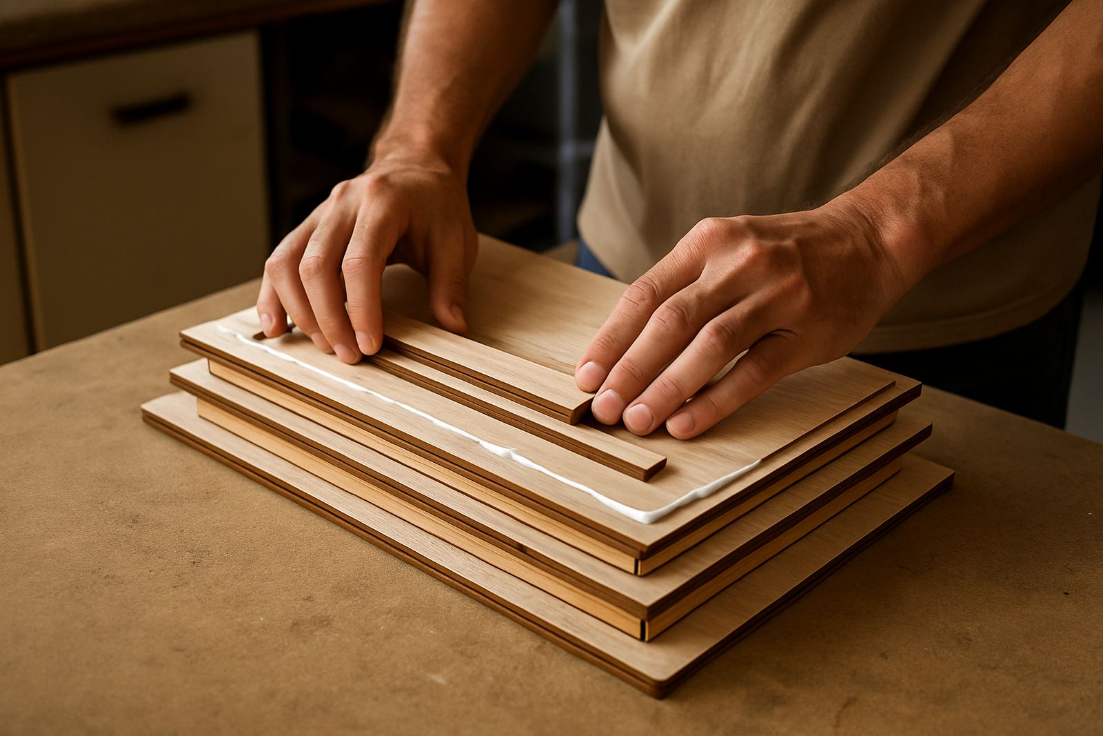
Spacing is not only about the wall around the sign, but also about the space inside the logo itself. Letters that are too close together can close up in shadow. Thin joins in a monogram can disappear once the room lighting changes through the day. When a logo is cut in wood, the spacing between letters, icons and border elements needs to work with the material thickness as well as the size of the sign.
Indoor signs in offices and retail areas often look best when there is a little more breathing room than there is on a printed page. This helps the logo stay legible from different angles. It also gives the sign a cleaner finish when seen under downlights or near a window. Marli from our design team often checks the artwork at actual size before production, because a logo that looks perfect on screen can feel cramped once it is cut and assembled.
- Avoid crowding text under an icon if the sign will be viewed quickly.
- Keep enough gap between layered pieces so shadows look neat not messy.
- Ask for a prototype sample if the logo has very fine script or tight curves.
Lighting Can Make Or Break The Finish
Lighting is often the difference between a sign that looks flat and one that stands out properly. Natural light from a west-facing window can shift through the afternoon, while indoor lighting may create hard reflections or deep shadows. A wooden logo sign needs to be tested where it will hang, because the same piece can look warm at midday and dark after load-shedding when the room changes to battery lights or backup lamps.
For most interiors, soft front light or angled lighting works well. It shows the grain, makes engraved detail easier to see and avoids harsh glare on varnished surfaces. If the sign is placed near strong sunlight, consider a finish that helps protect the wood from fading. In coastal areas like Strand, Gordon's Bay and Hermanus, humidity can also affect how a sign behaves over time, so proper sealing and finishing are worth the extra attention.
- Test the sign under the same light it will see every day.
- Use warm lighting for timber tones and cool lighting for sharper contrast.
- Near windows or sea air, choose a finish that suits the conditions and gives the sign a longer life.
A Local Example From A Helderberg Shop
A recent shop fitout in the Helderberg needed a logo sign above a counter where customers place orders and pay. The wall was painted white, the room had a lot of reflected light and the owner wanted the sign to feel welcoming without shouting at people. We cut the logo in layered wood so the shape held its own against the bright background, then adjusted the spacing so the smaller lettering stayed clear from across the queue line.
Once installed, the sign was lit from above with a soft angled fitting rather than a direct beam. That kept the texture visible and stopped glare on the finish. The owner told us it made the counter area easier to identify and gave the shop a more settled feel. That is often the goal with indoor logo signs: not just to show a name, but to help the space make sense at a glance. Even small changes in placement can shift how people move through a room.
- Reception areas benefit from clear centre placement and calm lighting.
- Retail counters need signs that read quickly from the customer waiting point.
- Event spaces often need larger signs because photos and videos add another layer of viewing.
Ordering A Sign That Fits The Space Properly
When clients send through a logo sign request, the first thing we ask for is the wall size, the intended viewing distance and a photo of the space if possible. That gives a much better result than guessing from the artwork alone. It also helps us advise on material thickness, mounting method and whether the sign should be made as a single piece or in sections for easier installation and courier packing.
For businesses across Somerset West, Stellenbosch, Cape Town, Paarl and Hermanus, this is especially useful when the sign has to travel by courier or be fitted in a tight window before an event. A practical plan saves time and avoids last minute surprises. If your logo sign is going into a reception, shop, office or wedding venue, think about the wall first, then the light, then the finish. In that order, the sign is far more likely to look right on day one and still look right months later.