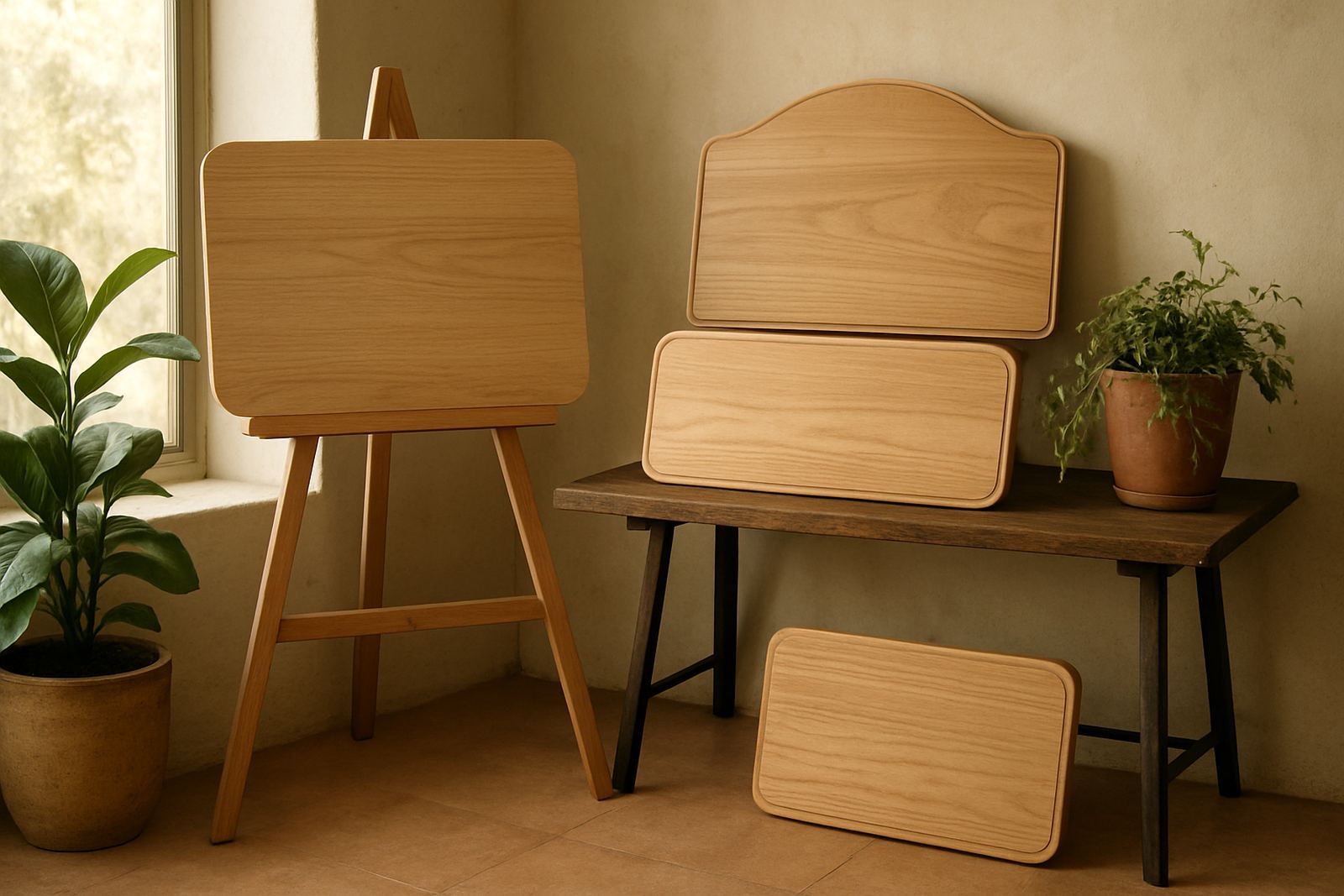

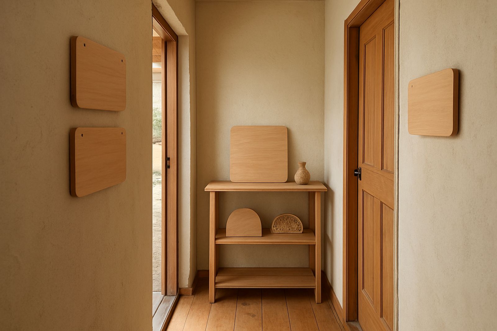
Why small signs fail when the layout is crowded
A compact sign does not have to look busy. In fact, the smaller the sign, the more every millimetre matters. If too many words are forced into one panel, the eye has to work harder and the message loses clarity from a few steps away. This is common on door signs, shelf labels, wedding table markers and reception nameplates where people only glance for a second.
The best small space signage uses a clear hierarchy. The main word or name should carry most of the weight, with supporting details kept smaller and quieter. If the sign is for a shop, office or venue in Somerset West or Stellenbosch, it should still be readable in bright window light, shaded passages and evening lighting where shadows can soften the lettering.
- Use fewer words where possible.
- Choose a simple shape that suits the content.
- Leave space around the letters so they do not feel cramped.
- Keep the most important information at eye level.
Choosing proportions that suit the room
The right proportions depend on where the sign will live. A narrow hanging plaque at a home entrance needs a different treatment from a small directional sign in a Paarl tasting room or a compact price sign at a market stall in Cape Town. A sign that is too tall can look heavy, while one that is too wide may feel lost on a narrow wall or door.
For interiors, a smaller sign often works best when the lettering takes up roughly two thirds of the face, leaving a border that gives the piece breathing room. For outdoor use, especially in coastal areas such as Gordon's Bay, Strand and Hermanus, a little extra margin helps the sign cope better with salty air, wind and occasional dampness. The goal is not to fill every corner, but to make the sign feel settled in its space.
- Measure the wall, door or counter first.
- Check the viewing distance, not only the available space.
- Allow extra margin for mounting hardware.
- Think about sunlight, glare and reflections on nearby glass.
Material and finish choices for small signs
Small signs can look premium without needing a large footprint. Wood gives warmth and suits homes, boutiques, guest houses and wedding venues, while layered cut pieces can create depth without making the sign bulky. A clean sanded finish works well for a modern interior, while a more natural grain suits rustic decor and event pieces. For business use, the finish should also stand up to daily handling, cleaning and movement.
On the Western Cape coast, humidity can affect unfinished or poorly sealed pieces, so the finish matters just as much as the design. In a shop on a busy street in Cape Town or a venue near the sea in Hermanus, a sealed surface is easier to keep clean and stays looking neat for longer. If the sign will be packed and couriered, the edge detail and the final coat must also be strong enough to travel safely.
Laser cutting and engraving are especially useful on smaller pieces because they allow crisp edges and fine detail without making the sign look overworked. That means a neat room number plaque, a compact bathroom sign or a small corporate gift sign can still carry personality without losing legibility.
Examples that work in homes, weddings and small shops
Small space signage is often used where the message needs to be clear but not loud. A townhouse in Somerset West may need a slim entrance sign with a family name and unit number. A wedding in Stellenbosch may need table markers that fit comfortably beside glassware and flowers. A boutique in Durbanville may need compact signage for fitting rooms, shelves or payment points.
Here are a few formats that usually work well:
- Door plaques with one family name and one line of supporting text.
- Table numbers or name cards for weddings and functions.
- Counter signs for payment, collections or opening hours.
- Small directional signs for bathrooms, parking or venue rooms.
- Gift signs with a name, date or short message for special occasions.
The best results come from keeping the purpose very specific. A small sign should not try to do three jobs at once. If it is guiding guests to a venue entrance in Gordon's Bay, it should guide them clearly. If it is marking a shelf in a Paarl shop, it should be read quickly and then left to do its work quietly.
How to brief a small sign so the wording fits
A short brief saves time and avoids awkward spacing later. When the wording is final, it is easier to choose the right font size, border width and material thickness. If the sign is for a business, it helps to know where it will be mounted, whether it needs to be indoors or outdoors, and how many people will view it at once. A sign for a single office door needs different treatment from one placed where clients queue or walk past in groups.
Useful details to share when placing an order:
- The exact wording, including spelling and capital letters.
- The final size in millimetres or centimetres.
- Where the sign will be used, indoors or outdoors.
- The mounting method, such as wall fixing, stand or hanging.
- Whether the sign must match existing decor or branding.
For couriers, smaller items need proper packing because thin pieces can move inside a box and chip at the corners. That is why spacing, thickness and finishing all matter. A good brief keeps the sign readable and the final piece strong enough for delivery across the Western Cape and further afield.
A local example from Somerset West to Hermanus
A small sign for a guest room in Somerset West might only need a name, a room number and a small motif. If the same sign were made too busy, it would be harder to read and the room would feel cluttered before guests even open the door. By choosing a restrained layout, the sign can suit a modern home, a coastal apartment or a wedding venue without needing to be reworked for each setting.
We often see the same principle in work for nearby towns like Cape Town, Paarl and Hermanus. A compact sign for a reception counter may look simple at first glance, but simple does not mean plain. The right border, the right depth and the right spacing can make a small sign feel considered and tidy. That is often what people remember most: not how much was on the sign, but how easy it was to read.
In small space signage, the design job is to keep the message useful and the object pleasant to look at. When those two things line up, the sign works well in a home, a shop or a venue, even if the wall it sits on is no bigger than a doorway.